
Vinay
Starting Point: Legacy Assets
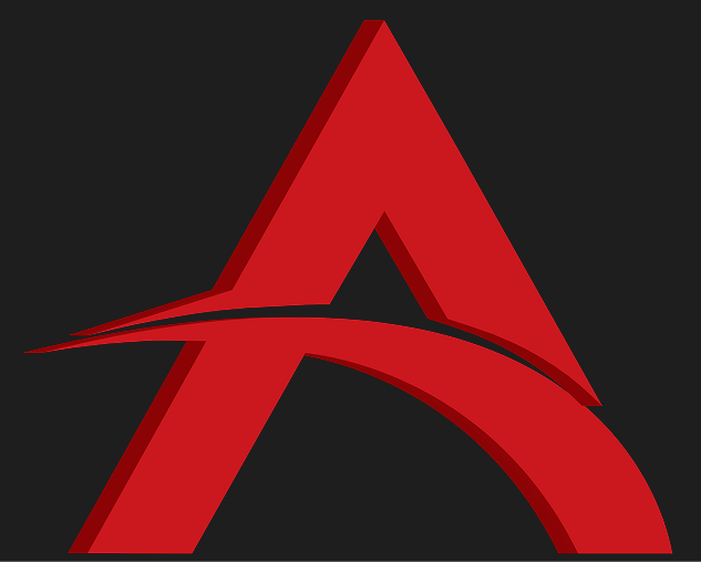
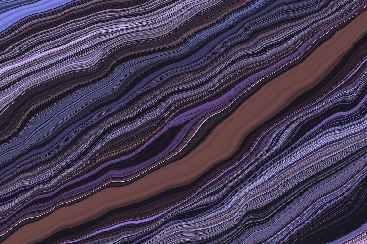
Image 1
Old logo (legacy foundation)
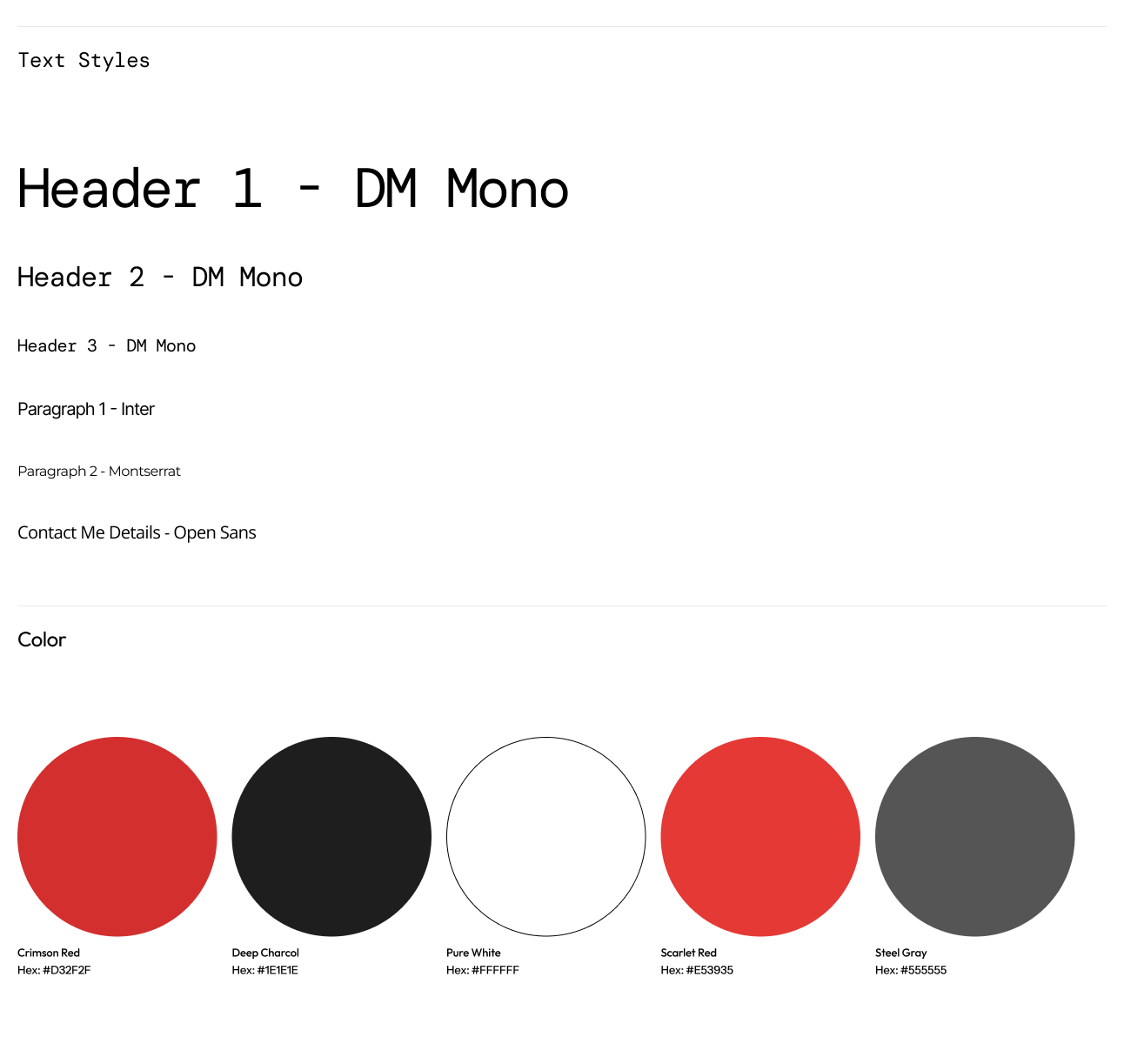
Image 2
Initial Type & Color set based on legacy logo
I used the existing logo as a foundation to form a preliminary color palette and typography as shown in Image 2. This triggered a stakeholder discussion about modernizing the brand.
I produced a woking homepage, but I wasn’t satisfied: the typography felt inconsistent and the palette was overly constrained by the legacy red.
This triggered a stakeholder discussion about modernizing the brand.
Atirath Website
Transforming a single-page presence into a full rental platform

Role
Brand Identity
Design Language
UI/UX Design
Front-End Development

Company
Atirath Technologies, Hyderabad, India

Timeline
Concept

Identity Revamp
Lo-Fi
Hi-Fi
Build (Homepage)
Atirath Website

Project Overview
Atirath needed a credible, modern web presence that reflected its AI Solutions, I owned the end-to-end journey: I started with the company’s legacy logo and built an initial homepage, then led to a full identity refresh, designed a new homepage system in Figma, and finally implemented it in Code.
Outcome at a glance
1
Identity revamp (logo, palette, typography) aligned to product & narrative.
2
Iterative lo-fi to hi-fi wireframe creation process to reduce the risk of “perfection paralysis”.
3
Design to dev handoff process optimized via dev-ready Figma panels.
4
Hi-fi prototype translated to a responsive React build of the homepage in 2 Days.
Brand Story (for the New Identity)
Idea
From Date to Decisions. Atirath builds bridges from raw fragmented data to confident, scalable decisions.
Symbol
The new mark represents connected nodes and a flowing bridge, a path that steps upward, hinting at progress and enterprise-grade scalability.
Voice
Clear, research-led, and trustworthy. The logo represents technical depth without jargon.
New Colors and Typography
Color Rationale
Twilight Blue (#4654A3)
Stability, professionalism, and depth. Works well for headings and accent elements.
Cobalt Blue (#3B5CC6)
Vibrant, modern, and energetic—used for highlights, CTAs, and visual emphasis.
Midnight Indigo (#270949)
A deep, moody tone that reinforces trust and seriousness.
Frost Mist (#D6DFE7)
A subtle, airy background tone that introduces lightness and balance.
Type Rationale
Aa
Headlines (Comfortaa)
Comfortaa provides a rounded, approachable tone that keeps the brand modern and human.
Aa
Body & Supporting Text (Montserrat)
Montserrat ensures strong readability across devices, with versatile weights for hierarchy.
Sys
Systemization
Extensive text styles (Headers 1–10, Paragraphs, CTA, KPI, Navigation) defined to ensure consistency across every surface of the brand.
Process Shift: From Perfection to Progress
Initially, I chased a perfect hero header and repeatedly restarted. The fix: layout the entire page in low fidelity first, validate content coverage, then iterate forward.

- Lo‑Fi sweep: Wire sections for Hero, Solutions, Impact, Metrics, Deployment, CTA—pure structure.
- Incremental refinements: On each pass, refine one element (e.g., spacing rhythm, card elevation, chip styles, arrow interactions).
- Hi‑Fi convergence: Without over‑focusing on any single component, the page matured naturally into a consistent high‑fidelity prototype
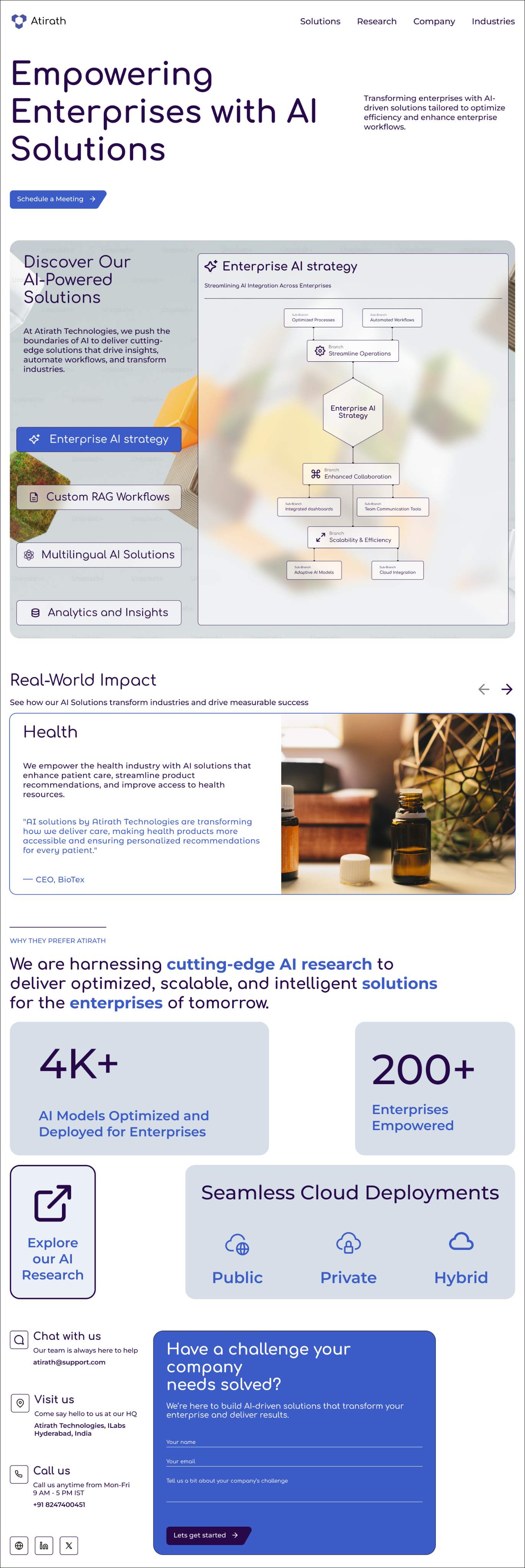
Image 1
Low - Fidelity Prototype
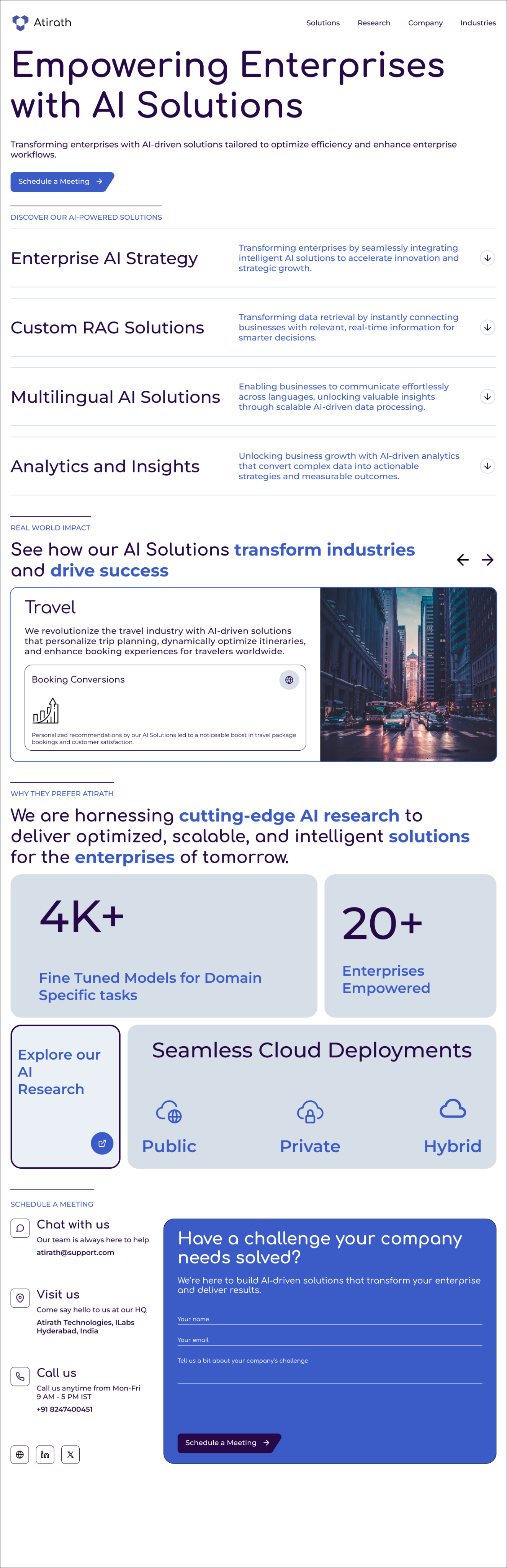
Image 2
High - Fidelity Prototype
Bridging UX/UI & Front End Development
Past projects revealed a visual gap between delivered designs and built screens. I closed this gap by creating Dev‑Ready Panels in Figma and then building the homepage myself.

Auto Layout Everywhere
I set up frames so elements snap into place and keep consistent spacing, making it easy to adjust content without breaking the design.

Reusable Styles
Colors, text sizes, and effects wee saved as shared styles, so any change updated everywhere at once.

Flexible Resizing
Each component was prepared to adapt to desktop, tablet, and mobile, ensuring responsiveness by default.

Ready-made building blocks
Buttons, cards, and tabs were built with different states (normal, hover, clicked, disabled) to make development efficient.

Clear labels and notes
Every layer and element was named properly and incorporated with Auto layout properties to make Development as smooth and efficient as possible.
What changed operationally
Handoff time for front-end translation dropped by 4x because the spec was effectively code-adjacent.
Visual parity improved to near 1:1 because spacing, radii, and typography were systemized up front.
From Figma to Code (REACT)
I implemented the homepage in React with CSS modules, focusing on component parity, responsiveness, and accessible interactions.
Highlights
Responsive grid & breakpoints
Tuned around 768px/1024px for common devices
Interactive sections
Solution accordions, industry carousel with prev/next sections, smooth scroll to contact section
Form handling
Basic validation, clean payload, and API POST for submissions
Accessibility
HTML Structure, focusable controls, readable contrast, keyboard-reachable buttons

Tech Stack
REACT (JSX, hooks: useState, useEffect, useRef)
CSS Modules (scoped, tokenized spacing/typography)
Asset pipeline for imagery & SVG Icons

Build Metric
Design
Responsive coded homepage in 2 days, including interaction wiring
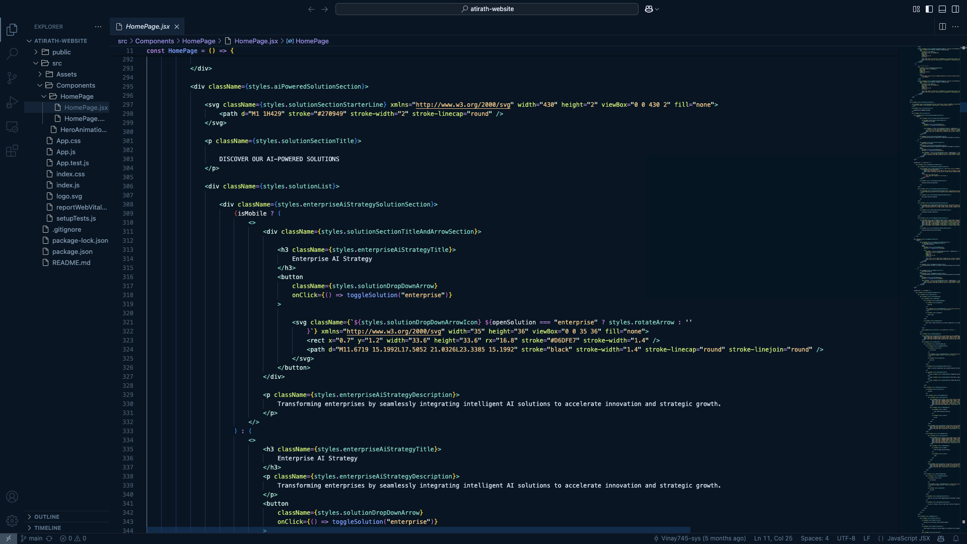
Key Sections of the Homepage
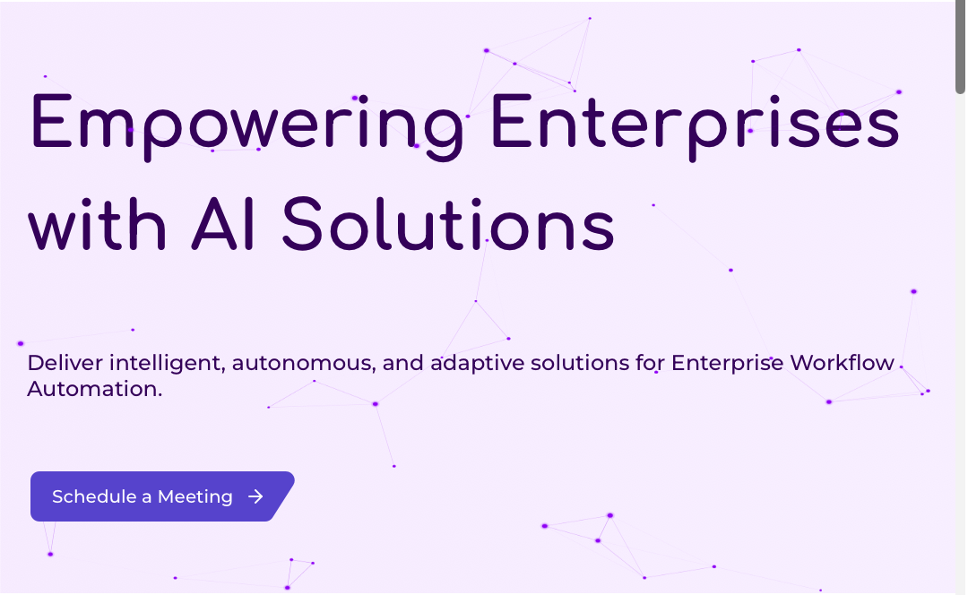
Hero Section
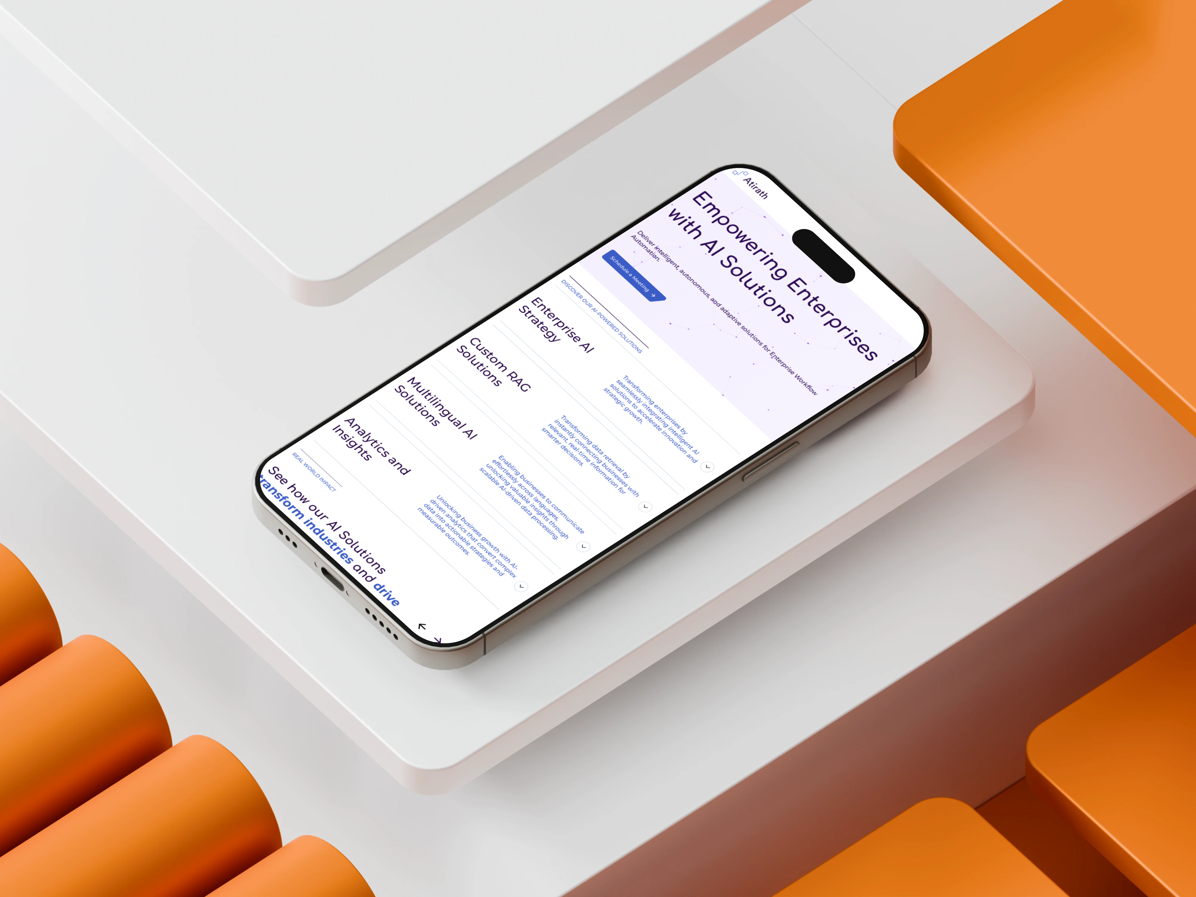
Hero section with a strong headline, a concise supporting statement, a clear call-to-action, and a dynamic animated background
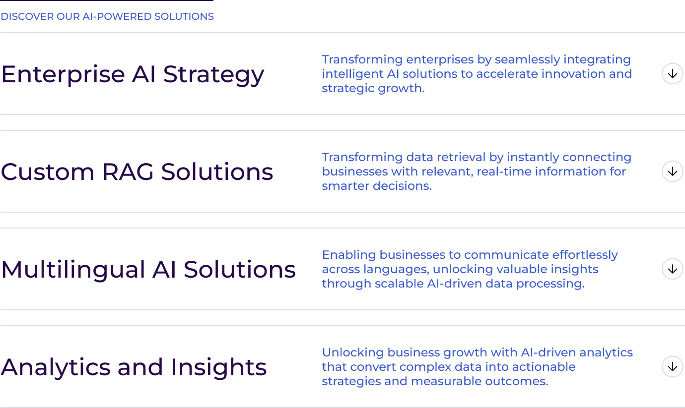
Solutions Section
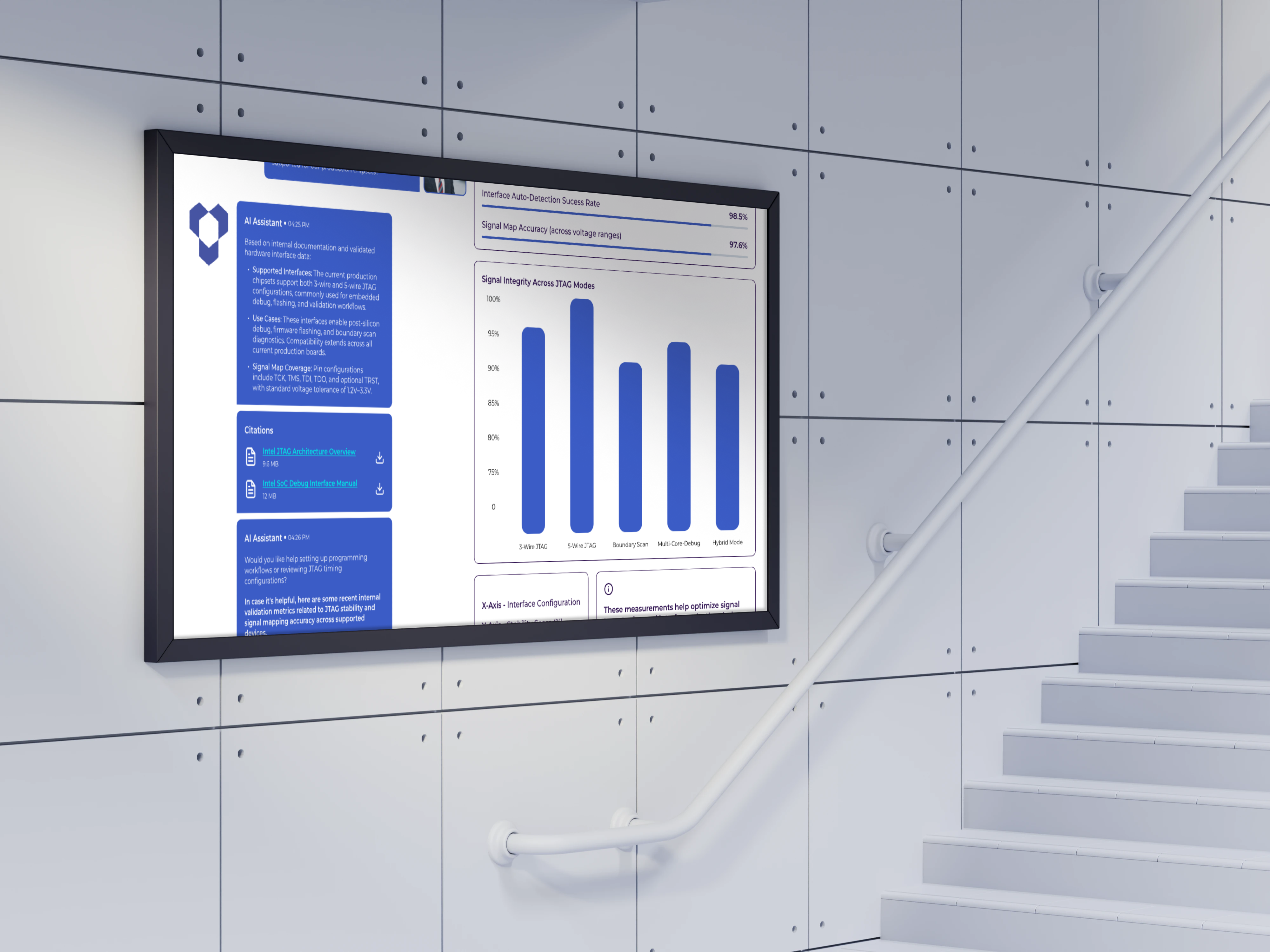
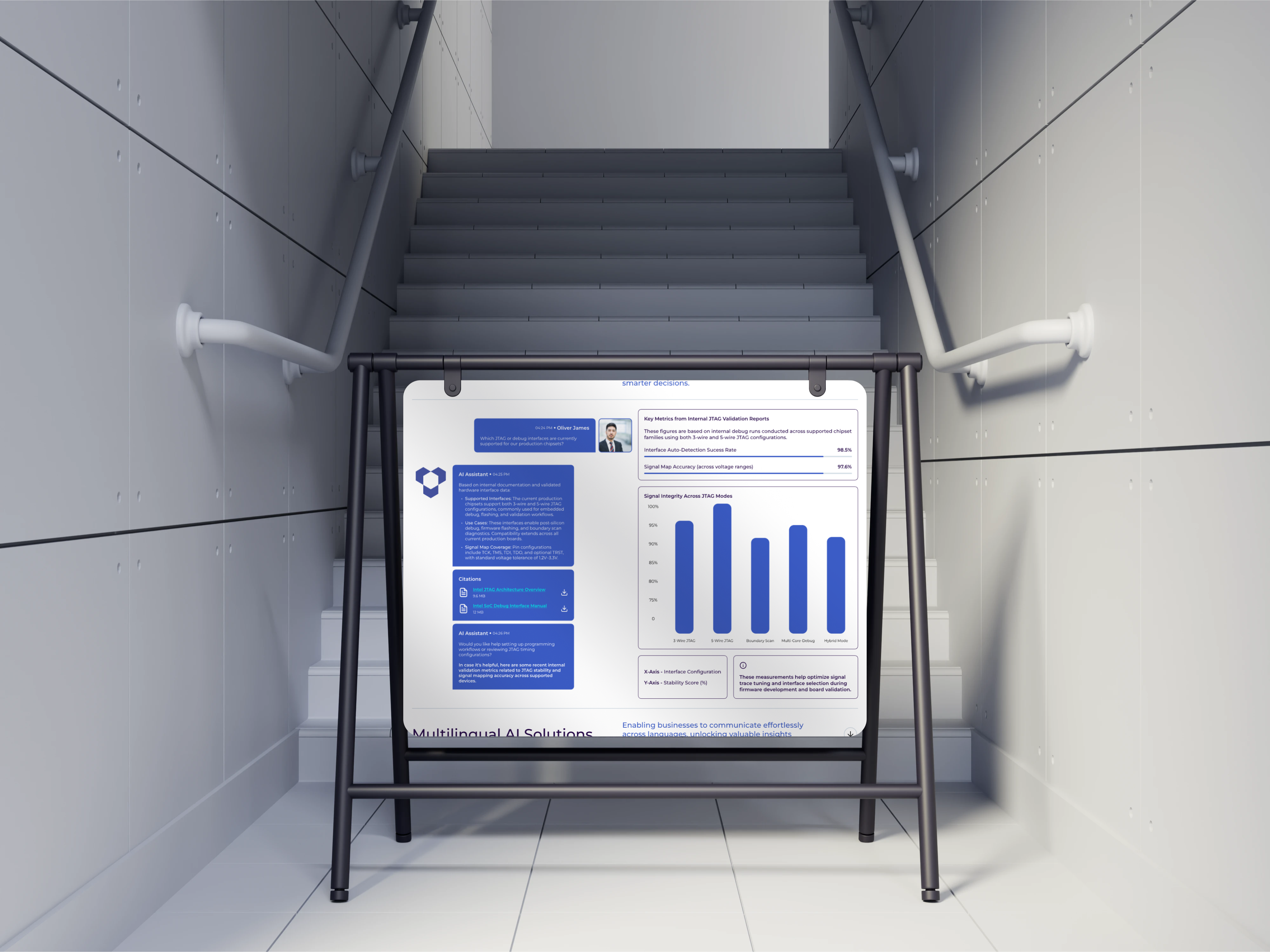
Expandable list of AI-powered solutions with deeper insights for each
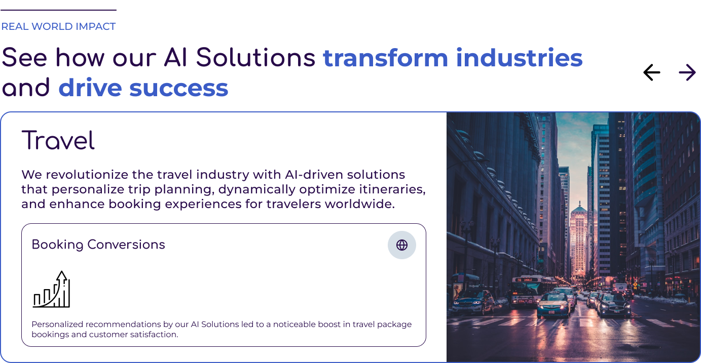
Real-World Impact Section
Carousel of industries highlighting impact stories and measurable results
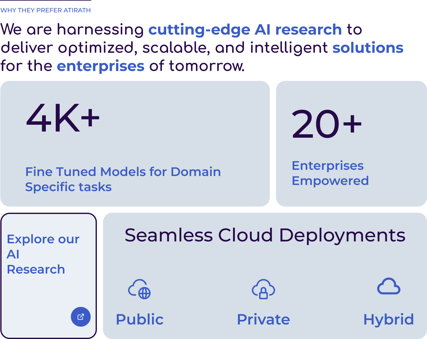
Why Atirath Section
A credibility section highlighting Atirath’s AI research strengths, key performance metrics, and flexible deployment options, paired with a call-to-action to explore further.
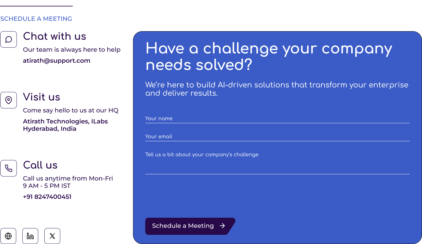
Contact/CTA Section
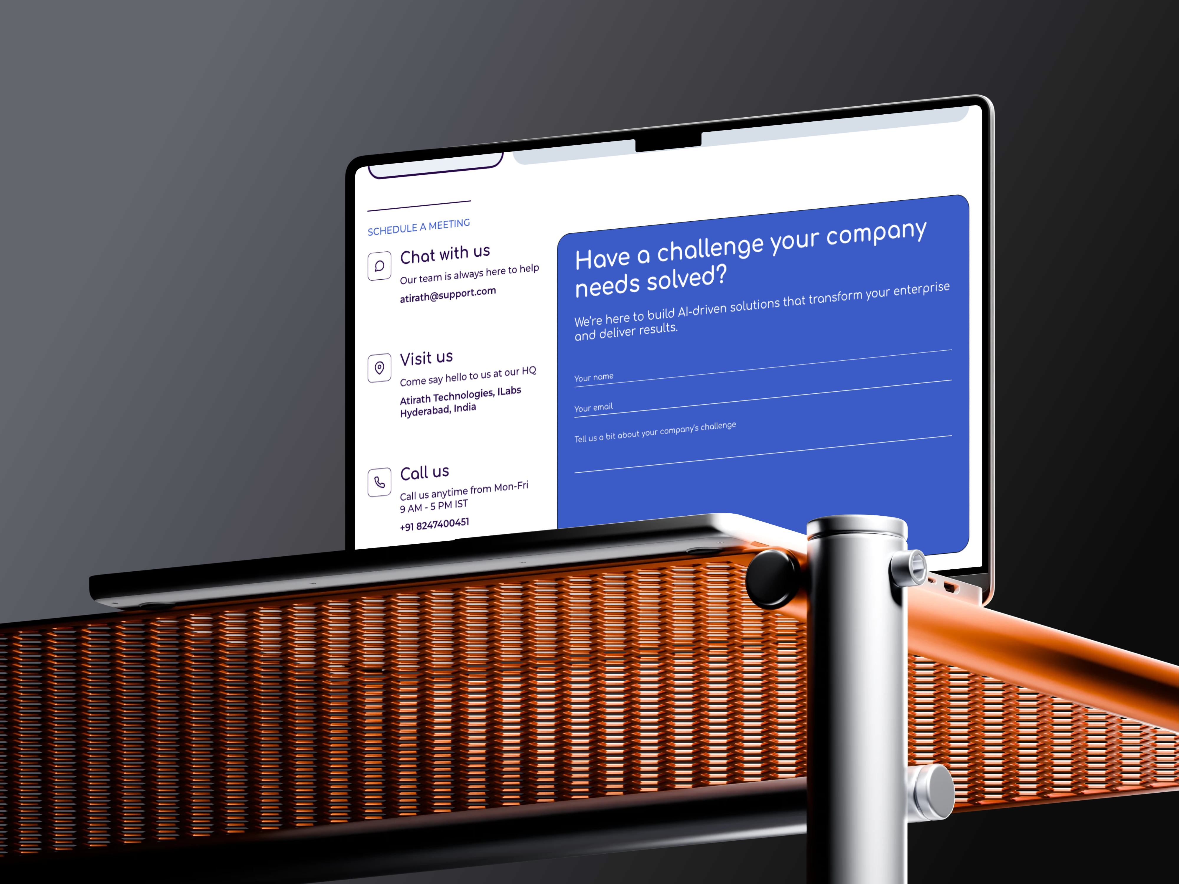
A closing section combining quick contact options (chat, call, visit) with a form and a strong ‘Schedule a Meeting’ button to drive lead generation.
Before → After (Summary)
Before
Legacy Logo
Constrained Palette
Typography lacked Cohesion
Striving for instant design Perfectionism stalled progress
After
Modern identity with a clear data-to-decisions narrative
Systemized Typography, color pallet, and web components
Iterative Lofi → Hifi wireframe creation workflow accelerated the design process
Dev-Ready FIGMA components delivered a fast, responsive and high-quality REACT build
Learnings & Impact

01
Design systems save time
By setting up a Typography, color pallet, and a component library early, I was able to move faster and avoid fixing things later.

02
Thinking like a developer helps
Preparing my designs so they could be used almost directly in code made the handoff made the design to development transition very smooth.

03
Small steps work best
Instead of chasing the “perfect design” from the start, building simple drafts and improving them bit by bit led to a better final result.
Vinay
Starting Point: Legacy Assets
Image 1
Old logo (legacy foundation)
Image 2
Initial Type & Color set based on legacy logo
I used the existing logo as a foundation to form a preliminary color palette and typography as shown in Image 2. This triggered a stakeholder discussion about modernizing the brand.
I produced a woking homepage, but I wasn’t satisfied: the typography felt inconsistent and the palette was overly constrained by the legacy red.
This triggered a stakeholder discussion about modernizing the brand.
Atirath Website
Transforming a single-page presence into a full rental platform

Role
Brand Identity
Design Language
UI/UX Design
Front-End Development

Company
Atirath Technologies, Hyderabad, India

Timeline
Concept
Identity Revamp
Lo-Fi
Hi-Fi
Build (Homepage)
Atirath Website
Project Overview
Atirath needed a credible, modern web presence that reflected its AI Solutions, I owned the end-to-end journey: I started with the company’s legacy logo and built an initial homepage, then led to a full identity refresh, designed a new homepage system in Figma, and finally implemented it in Code.
Outcome at a glance
1
Identity revamp (logo, palette, typography) aligned to product & narrative.
2
Iterative lo-fi to hi-fi wireframe creation process to reduce the risk of “perfection paralysis”.
3
Design to dev handoff process optimized via dev-ready Figma panels.
4
Hi-fi prototype translated to a responsive React build of the homepage in 2 Days.
Brand Story (for the New Identity)
Idea
From Date to Decisions. Atirath builds bridges from raw fragmented data to confident, scalable decisions.
Symbol
The new symbol represents connected nodes and a flowing bridge, a path that steps upward, hinting at progress and enterprise-grade scalability.
Voice
Clear, research-led, and trustworthy. The logo represents technical depth without jargon.
New Colors and Typography
Color Rationale
Twilight Blue (#4654A3)
Stability, professionalism, and depth. Works well for headings and accent elements.
Cobalt Blue (#3B5CC6)
Vibrant, modern, and energetic—used for highlights, CTAs, and visual emphasis.
Midnight Indigo (#270949)
A deep, moody tone that reinforces trust and seriousness.
Frost Mist (#D6DFE7)
A subtle, airy background tone that introduces lightness and balance.
Type Rationale
Aa
Headlines (Comfortaa)
Comfortaa provides a rounded, approachable tone that keeps the brand modern and human.
Aa
Body & Supporting Text (Montserrat)
Montserrat ensures strong readability across devices, with versatile weights for hierarchy.
Sys
Systemization
Extensive text styles (Headers 1–10, Paragraphs, CTA, KPI, Navigation) defined to ensure consistency across every surface of the brand.
Process Shift: From Perfection to Progress
Initially, I chased a perfect hero header and repeatedly restarted. The fix: layout the entire page in low fidelity first, validate content coverage, then iterate forward.

- Lo‑Fi sweep: Wire sections for Hero, Solutions, Impact, Metrics, Deployment, CTA—pure structure.
- Incremental refinements: On each pass, refine one element (e.g., spacing rhythm, card elevation, chip styles, arrow interactions).
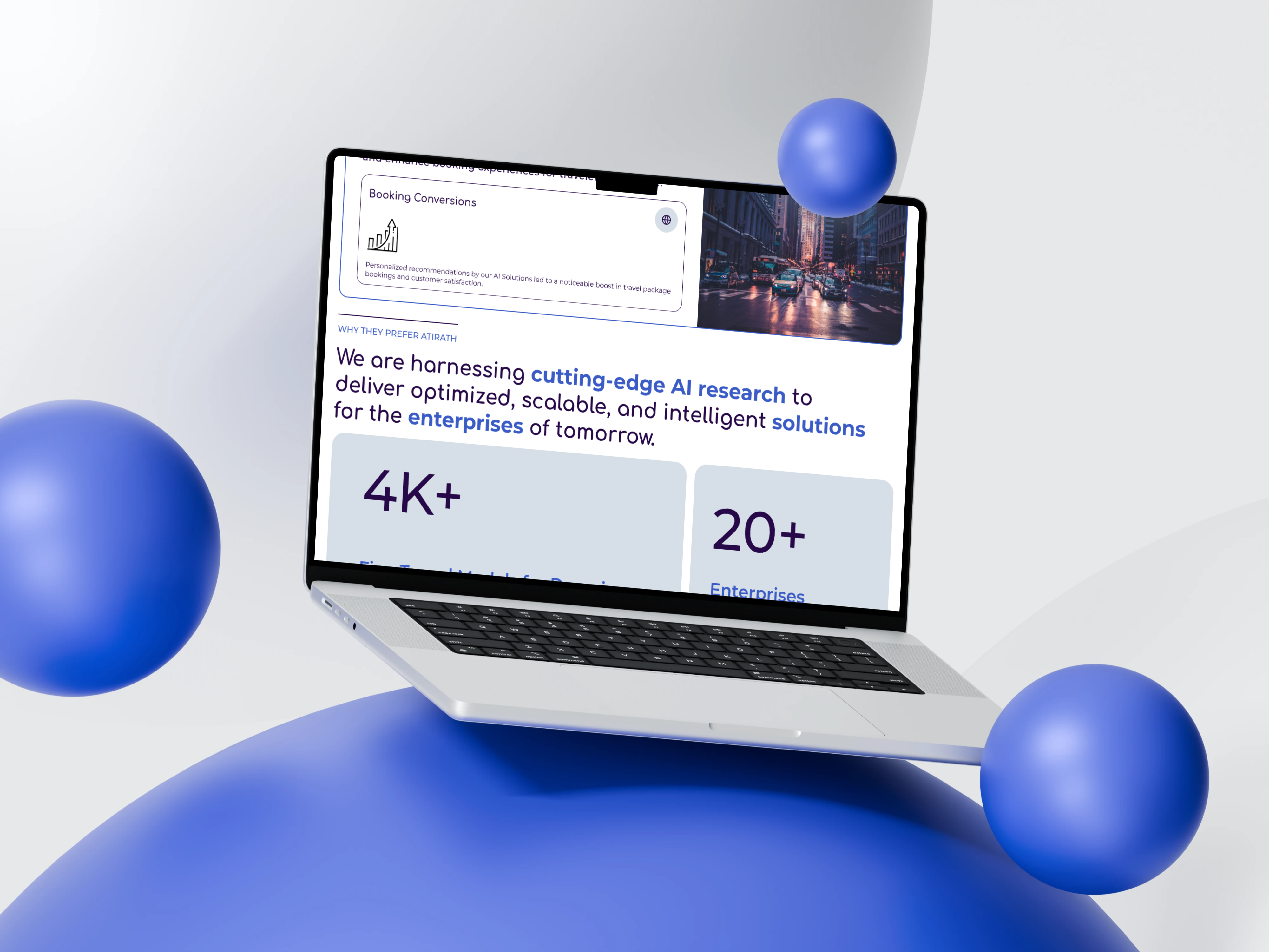
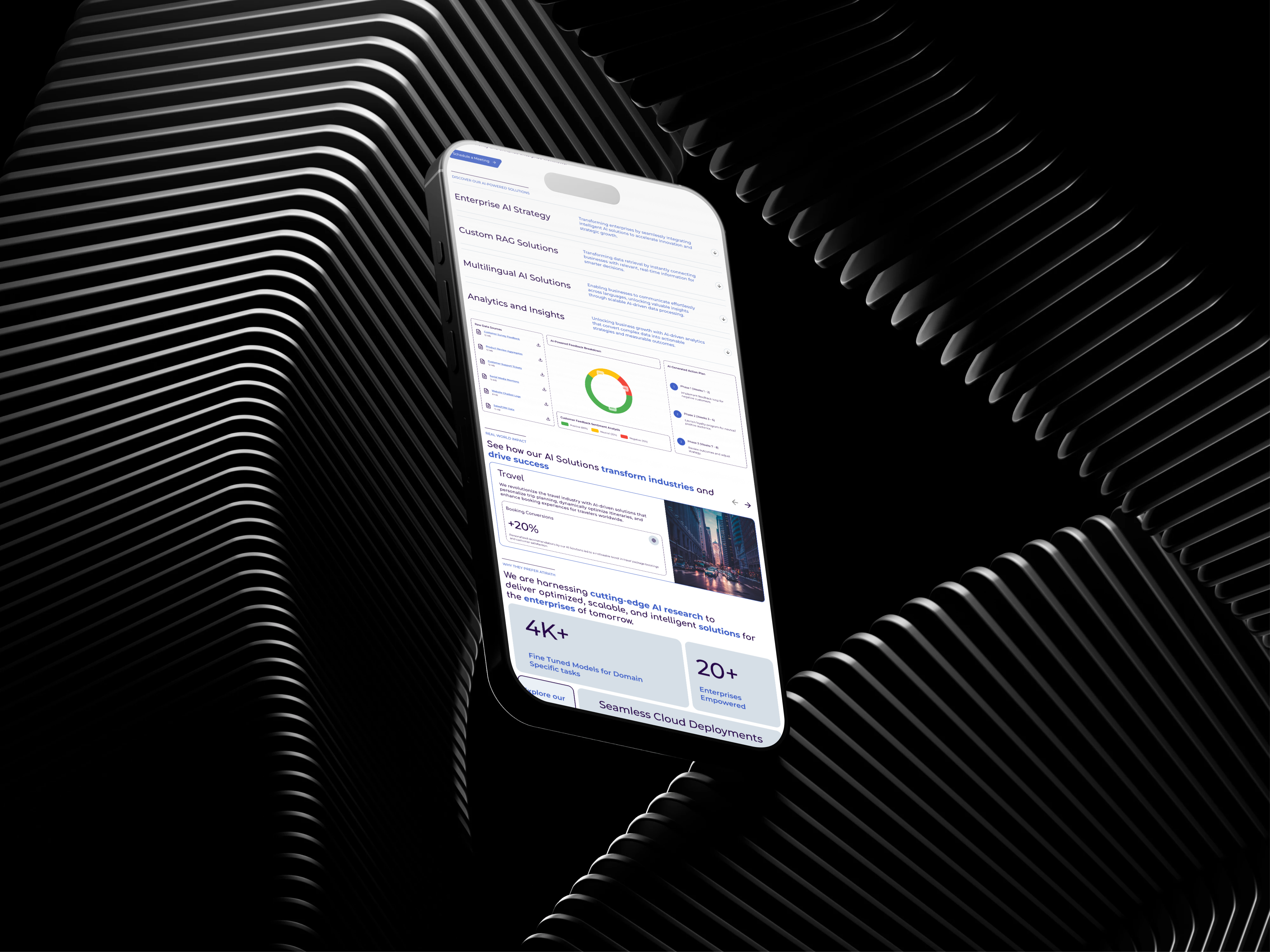
- Hi‑Fi convergence: Without over‑focusing on any single component, the page matured naturally into a consistent high‑fidelity prototype
Image 1
Low - Fidelity Prototype
Image 2
High - Fidelity Prototype
Bridging UX/UI & Front End Development
Past projects revealed a visual gap between delivered designs and built screens. I closed this gap by creating Dev‑Ready Panels in Figma and then building the homepage myself.
Auto Layout Everywhere
I set up frames so elements snap into place and keep consistent spacing, making it easy to adjust content without breaking the design.
Reusable Styles
Colors, text sizes, and effects wee saved as shared styles, so any change updated everywhere at once.
Flexible Resizing
Each component was prepared to adapt to desktop, tablet, and mobile, ensuring responsiveness by default.
Ready-made building blocks
Buttons, cards, and tabs were built with different states (normal, hover, clicked, disabled) to make development efficient.
Clear labels and notes
Every layer and element was named properly and incorporated with Auto layout properties to make Development as smooth and efficient as possible.
What changed operationally
Handoff time for front-end translation dropped by 4x because the spec was effectively code-adjacent.
Visual parity improved to near 1:1 because spacing, radii, and typography were systemized up front.
From Figma to Code (REACT)
I implemented the homepage in React with CSS modules, focusing on component parity, responsiveness, and accessible interactions.
Highlights
Responsive grid & breakpoints
Tuned around 768px/1024px for common devices
Interactive sections
Solution accordions, industry carousel with prev/next sections, smooth scroll to contact section
Form handling
Basic validation, clean payload, and API POST for submissions
Accessibility
HTML Structure, focusable controls, readable contrast, keyboard-reachable buttons
Tech Stack
REACT (JSX, hooks: useState, useEffect, useRef)
CSS Modules (scoped, tokenized spacing/typography)
Asset pipeline for imagery & SVG Icons
Build Metric
Design
Responsive coded homepage in 2 days, including interaction wiring
Key Sections of the Homepage
Hero Section
Hero section with a strong headline, a concise supporting statement, a clear call-to-action, and a dynamic animated background
Solutions Section
Expandable list of AI-powered solutions with deeper insights for each
Real-World Impact Section
Carousel of industries highlighting impact stories and measurable results
Why Atirath Section
A credibility section highlighting Atirath’s AI research strengths, key performance metrics, and flexible deployment options, paired with a call-to-action to explore further.
Contact/CTA Section
A closing section combining quick contact options (chat, call, visit) with a form and a strong ‘Schedule a Meeting’ button to drive lead generation.
Before → After (Summary)
Before
Legacy Logo
Constrained Palette
Typography lacked Cohesion
Striving for instant design Perfectionism stalled progress
After
Modern identity with a clear data-to-decisions narrative
Systemized Typography, color pallet, and web components
Iterative Lofi → Hifi wireframe creation workflow accelerated the design process
Dev-Ready FIGMA components delivered a fast, responsive and high-quality REACT build
Learnings & Impact

01
Design systems save time
By setting up a Typography, color pallet, and a component library early, I was able to move faster and avoid fixing things later.

02
Thinking like a developer helps
Preparing my designs so they could be used almost directly in code made the handoff made the design to development transition very smooth.

03
Small steps work best
Instead of chasing the “perfect design” from the start, building simple drafts and improving them bit by bit led to a better final result.
Vinay
Starting Point: Legacy Assets
Image 1
Old logo (legacy foundation)
Image 2
Initial Type & Color set based on legacy logo
I used the existing logo as a foundation to form a preliminary color palette and typography as shown in Image 2. This triggered a stakeholder discussion about modernizing the brand.
I produced a woking homepage, but I wasn’t satisfied: the typography felt inconsistent and the palette was overly constrained by the legacy red.
This triggered a stakeholder discussion about modernizing the brand.
Atirath Website
Transforming a single-page presence into a full rental platform

Role
Brand Identity
Design Language
UI/UX Design
Front-End Development

Company
Atirath Technologies, Hyderabad, India

Timeline
Concept
Identity Revamp
Lo-Fi
Hi-Fi
Build (Homepage)
Atirath Website

Project Overview
Atirath needed a credible, modern web presence that reflected its AI Solutions, I owned the end-to-end journey: I started with the company’s legacy logo and built an initial homepage, then led to a full identity refresh, designed a new homepage system in Figma, and finally implemented it in Code.
Outcome at a glance
1
Identity revamp (logo, palette, typography) aligned to product & narrative.
2
Iterative lo-fi to hi-fi wireframe creation process to reduce the risk of “perfection paralysis”.
3
Design to dev handoff process optimized via dev-ready Figma panels.
4
Hi-fi prototype translated to a responsive React build of the homepage in 2 Days.
Brand Story (for the New Identity)
Idea
From Date to Decisions. Atirath builds bridges from raw fragmented data to confident, scalable decisions.
Symbol
The new symbol represents connected nodes and a flowing bridge, a path that steps upward, hinting at progress and enterprise-grade scalability.
Voice
Clear, research-led, and trustworthy. The logo represents technical depth without jargon.
New Colors and Typography
Color Rationale
Twilight Blue (#4654A3)
Stability, professionalism, and depth. Works well for headings and accent elements.
Cobalt Blue (#3B5CC6)
Vibrant, modern, and energetic—used for highlights, CTAs, and visual emphasis.
Midnight Indigo (#270949)
A deep, moody tone that reinforces trust and seriousness.
Frost Mist (#D6DFE7)
A subtle, airy background tone that introduces lightness and balance.
Type Rationale
Aa
Headlines (Comfortaa)
Comfortaa provides a rounded, approachable tone that keeps the brand modern and human.
Aa
Body & Supporting Text (Montserrat)
Montserrat ensures strong readability across devices, with versatile weights for hierarchy.
Sys
Systemization
Extensive text styles (Headers 1–10, Paragraphs, CTA, KPI, Navigation) defined to ensure consistency across every surface of the brand.
Process Shift: From Perfection to Progress
Initially, I chased a perfect hero header and repeatedly restarted. The fix: layout the entire page in low fidelity first, validate content coverage, then iterate forward.
- Lo‑Fi sweep: Wire sections for Hero, Solutions, Impact, Metrics, Deployment, CTA—pure structure.
- Incremental refinements: On each pass, refine one element (e.g., spacing rhythm, card elevation, chip styles, arrow interactions).
- Hi‑Fi convergence: Without over‑focusing on any single component, the page matured naturally into a consistent high‑fidelity prototype
Image 1
Low - Fidelity Prototype
Image 2
High - Fidelity Prototype
Bridging UX/UI & Front End Development
Past projects revealed a visual gap between delivered designs and built screens. I closed this gap by creating Dev‑Ready Panels in Figma and then building the homepage myself.
Auto Layout Everywhere
I set up frames so elements snap into place and keep consistent spacing, making it easy to adjust content without breaking the design.
Reusable Styles
Colors, text sizes, and effects wee saved as shared styles, so any change updated everywhere at once.
Flexible Resizing
Each component was prepared to adapt to desktop, tablet, and mobile, ensuring responsiveness by default.
Ready-made building blocks
Buttons, cards, and tabs were built with different states (normal, hover, clicked, disabled) to make development efficient.
Clear labels and notes
Every layer and element was named properly and incorporated with Auto layout properties to make Development as smooth and efficient as possible.
What changed operationally
Handoff time for front-end translation dropped by 4x because the spec was effectively code-adjacent.
Visual parity improved to near 1:1 because spacing, radii, and typography were systemized up front.
From Figma to Code (REACT)
I implemented the homepage in React with CSS modules, focusing on component parity, responsiveness, and accessible interactions.
Highlights
Responsive grid & breakpoints
Tuned around 768px/1024px for common devices
Interactive sections
Solution accordions, industry carousel with prev/next sections, smooth scroll to contact section
Form handling
Basic validation, clean payload, and API POST for submissions
Accessibility
HTML Structure, focusable controls, readable contrast, keyboard-reachable buttons
Tech Stack
REACT (JSX, hooks: useState, useEffect, useRef)
CSS Modules (scoped, tokenized spacing/typography)
Asset pipeline for imagery & SVG Icons
Build Metric
Design
Responsive coded homepage in 2 days, including interaction wiring
Key Sections of the Homepage
Hero Section
Hero section with a strong headline, a concise supporting statement, a clear call-to-action, and a dynamic animated background
Solutions Section
Expandable list of AI-powered solutions with deeper insights for each
Real-World Impact Section
Carousel of industries highlighting impact stories and measurable results
Why Atirath Section
A credibility section highlighting Atirath’s AI research strengths, key performance metrics, and flexible deployment options, paired with a call-to-action to explore further.
Contact/CTA Section
A closing section combining quick contact options (chat, call, visit) with a form and a strong ‘Schedule a Meeting’ button to drive lead generation.
Before → After (Summary)
Before
Legacy Logo
Constrained Palette
Typography lacked Cohesion
Striving for instant design Perfectionism stalled progress
After
Modern identity with a clear data-to-decisions narrative
Systemized Typography, color pallet, and web components
Iterative Lofi → Hifi wireframe creation workflow accelerated the design process
Dev-Ready FIGMA components delivered a fast, responsive and high-quality REACT build
Learnings & Impact
01
Design systems save time
By setting up a Typography, color pallet, and a component library early, I was able to move faster and avoid fixing things later.
02
Thinking like a developer helps
Preparing my designs so they could be used almost directly in code made the handoff made the design to development transition very smooth.

03
Small steps work best
Instead of chasing the “perfect design” from the start, building simple drafts and improving them bit by bit led to a better final result.